
Settings panel
A three-tab settings dialog: sliders, a toggle, a dropdown, a text input, the language picker and a confirm modal. It ships in the Demo sample as SettingsDemo, in English, Turkish and Japanese.
This is the shape most world panels end up being, so it is the most useful thing to copy.
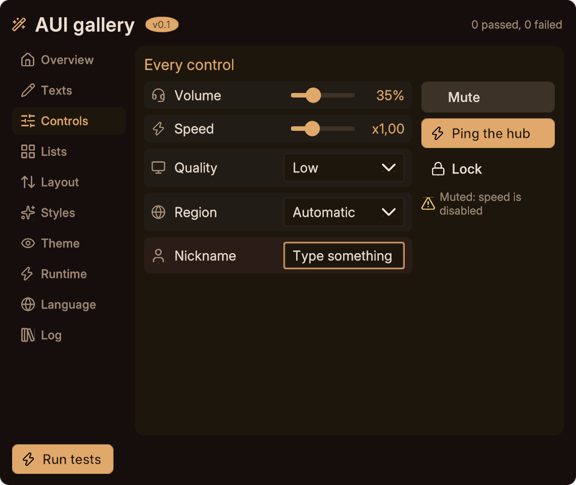
The gallery's Controls page is built the same way, and shows what these rows look like:
The markup
<view name="SettingsDemo" width="440" height="400">
  <panel class="row">
    <icon name="sliders-horizontal" size="22"/>
    <text key="demo.title" class="title"/>
    <spacer/>
    <button onclick="AskReset" icon="refresh-cw" class="ghost"/>
    <button id="close" onclick="Close" icon="x" class="ghost"/>
  </panel>

  <tabs bind="{page}" onchange="PageChanged">
    <tab page="general" key="demo.general" icon="monitor"/>
    <tab page="audio"   key="demo.audio"   icon="headset"/>
    <tab page="lang"    key="demo.language" icon="globe"/>
  </tabs>

  <pages id="main" mode="crossfade">
    <page id="general">
      <panel class="setting">
        <text key="demo.brightness"/><spacer/>
        <slider bind="{brightness}" min="0" max="100" step="1"
                format-key="demo.volfmt" onchange="BrightnessChanged"/>
      </panel>
      <panel class="setting">
        <text key="demo.solid"/><spacer/>
        <toggle bind="{solid}" icon="check" onchange="SolidChanged"/>
      </panel>
      <panel class="setting">
        <text key="demo.quality"/><spacer/>
        <select bind="{quality}" onchange="QualityChanged">
          <option value="low" key="demo.q.low"/>
          <option value="medium" key="demo.q.medium"/>
          <option value="high" key="demo.q.high"/>
        </select>
      </panel>
    </page>

    <page id="audio">
      <panel class="setting">
        <text key="demo.volume"/><spacer/>
        <slider bind="{volume}" min="0" max="100" step="1" format-key="demo.volfmt"
                disabled="{muted}" onchange="VolumeChanged"/>
      </panel>
      <panel class="setting">
        <text key="demo.mute"/><spacer/>
        <toggle bind="{muted}" icon="check" onchange="MuteChanged"/>
      </panel>
      <panel class="setting">
        <text key="demo.nick"/><spacer/>
        <input bind="{nick}" placeholder-key="demo.nickph" onsubmit="NickSubmitted"/>
      </panel>
    </page>

    <page id="lang"><AuiLanguagePicker/></page>
  </pages>

  <panel class="footer">
    <text key="demo.signedIn" args="{playerName}" class="muted"/>
    <spacer/>
    <button onclick="Greet" key="demo.greet" icon="sparkles" class="primary"/>
  </panel>

  <modal id="reset" enabled="{asking}" onclose="ResetCancelled">
    <text key="demo.resetSure"/>
    <panel class="row">
      <spacer/>
      <button onclick="CloseReset" key="demo.no" class="ghost"/>
      <button onclick="DoReset" key="demo.yes" class="primary"/>
    </panel>
  </modal>
</view>.setting, .footer and .primary come from the sibling SettingsDemo.auis. .row, .muted and .ghost come from the package theme.
The sheet
.setting {
  flex-direction: row;
  align: center;
  gap: 12;
  padding: 6 10;
  background: sprite(Rounded8) var(--card);
  transition: background 0.12s out-quad;
}
.setting:hover { background: var(--panel); }

.footer { flex-direction: row; align: center; gap: 12; }

.primary          { background: sprite(Rounded8) var(--accent); color: var(--base); }
.primary:hover    { background: var(--text); scale: 1.03; }
.primary:pressed  { scale: 0.96; }
Two things worth noting. The hover look is a style rule, not a handler, so it costs nothing at runtime. And .setting being one class means every row lines up without repeating a style="".
The code
namespace Armagan.AUI.Generated
{
    public partial class SettingsDemo : AuiView
    {
        public WorldSettings world;      // set on the scene instance

        protected override void OnStart()
        {
            PlayerName = Networking.LocalPlayer.displayName;
            Brightness = 70f;            // moves the slider; no handler call
            Volume     = 50f;
        }

        public void Close()   { Hide(); }
        public void Greet()   { }
        public void PageChanged(int page) { }

        public void BrightnessChanged(float value) { if (world != null) world.SetBrightness(value); }
        public void SolidChanged(bool value)       { if (world != null) world.SetSolid(value); }
        public void QualityChanged(int value)      { if (world != null) world.SetQuality(value); }
        public void VolumeChanged(float value)     { if (world != null) world.SetVolume(value); }
        public void MuteChanged(bool value)        { if (world != null) world.SetMuted(value); }

        public void NickSubmitted(string value)    { PlayerName = value; }

        public void AskReset()       { Asking = true; }     // the binding opens the modal
        public void DoReset()        { Brightness = 70f; Volume = 50f; CloseReset(); }
        public void ResetCancelled() { }
    }
}
The translation keys
{
  "_name": "English",
  "demo": {
    "title": "Settings",
    "general": "General", "audio": "Audio", "language": "Language",
    "brightness": "Brightness", "solid": "Solid walls", "quality": "Quality",
    "volume": "Volume", "mute": "Mute", "nick": "Nickname",
    "nickph": "Type a name",
    "volfmt": "{value}%",
    "q": { "low": "Low", "medium": "Medium", "high": "High" },
    "signedIn": "Signed in as {playerName}",
    "greet": "Greet", "resetSure": "Reset everything?",
    "yes": "Yes", "no": "No"
  }
}
demo.volfmt is the slider's format-key, and its {value} is filled by the slider itself. demo.signedIn uses {playerName}, filled from the args binding.
What to take from it
- One class per repeated row shape (
.setting) rather than inline styles. - States in the sheet, handlers only for behaviour.
OnStartpulls, handlers push. The view reads the world's current state once and writes changes back as they happen.- The modal is opened by a binding (
Asking = true), so the dialog's state is part of your state rather than something you have to track separately. - Null-check every reference to another behaviour.
Next
- The gallery for one page per feature.
- Recipes for smaller snippets.
- Talking to other Udon scripts for the
worldfield above.